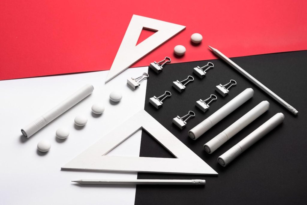
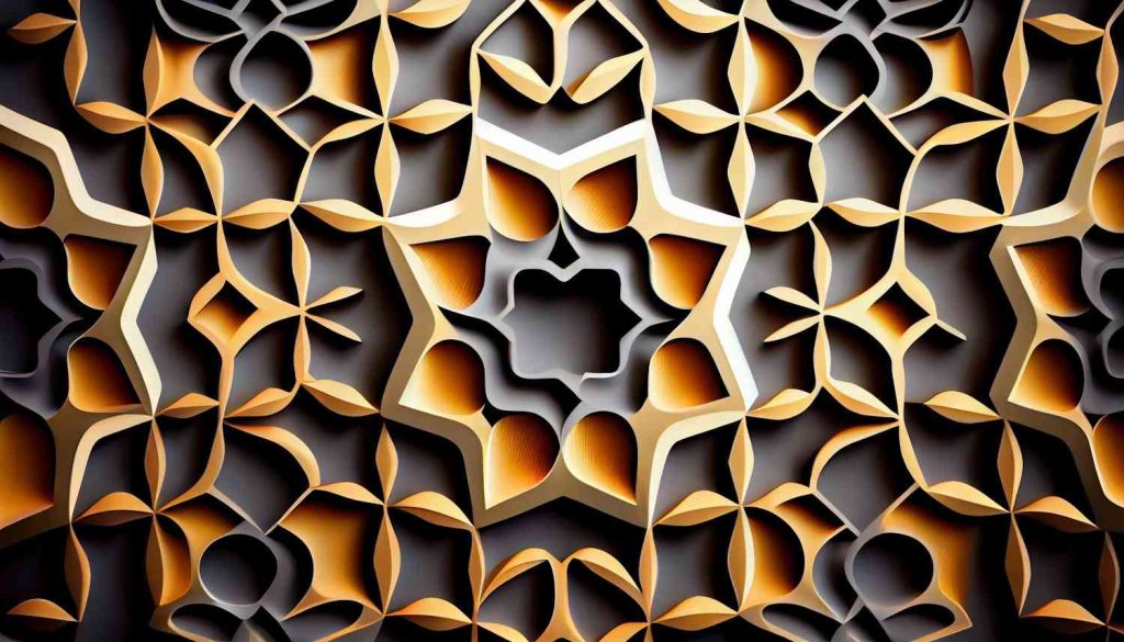
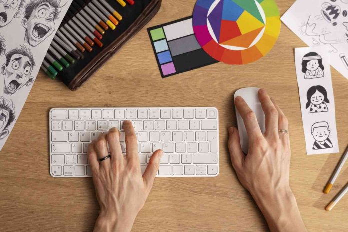
The design principle that indicates a project is visually satisfying is “visual harmony.” Visual harmony is achieved when all elements of a design are well-balanced and work together cohesively. It involves the thoughtful use of color, typography, spacing, and alignment to create a unified and aesthetically pleasing composition.
Other related principles that contribute to a visually satisfying design include:
- Balance: Distributing elements evenly to create stability in the design.
- Contrast: Using differences in color, size, and shape to create visual interest and hierarchy.
- Proportion: Ensuring that the size of elements relates well to each other and the overall design.
- Alignment: Arranging elements in a way that aligns them with one another, creating order and organization.
- Repetition: Repeating certain elements, such as colors or shapes, to create a sense of unity.
1. Visual Harmony

- Definition: Visual harmony refers to the balanced arrangement of elements in a design, where everything works together seamlessly.
- Why It Matters: Harmony ensures that no single element overwhelms the others, creating a sense of calm and order.
- How to Achieve It:
- Consistency: Use consistent color schemes, typography, and styles throughout your design.
- Related Elements: Group related elements together so they feel connected and reinforce the overall theme.
- Example: A website design where the color palette, fonts, and imagery all reflect the brand’s identity, making the user experience smooth and cohesive.
2. Balance

- Definition: Balance is the distribution of visual weight in a design, which can be symmetrical, asymmetrical, or radial.
- Why It Matters: Balance creates stability in a design, making it feel secure and well-structured.
- Types of Balance:
- Symmetrical Balance: Equal visual weight on either side of an axis.
- Example: A formal corporate brochure with equal margins and mirrored text and images on either side of the center.
- Asymmetrical Balance: Different elements are balanced in size, color, or placement without being identical.
- Example: A modern web page where a large image on one side is balanced by smaller text boxes on the other.
- Radial Balance: Elements radiate from a central point, creating a circular balance.
- Example: A mandala design, where patterns extend outward from the center.
- Symmetrical Balance: Equal visual weight on either side of an axis.
3. Contrast

- Definition: Contrast is the difference between two or more elements in a design, such as color, size, shape, or texture.
- Why It Matters: Contrast draws attention to key elements, making the design more dynamic and easier to navigate.
- How to Use It:
- Color: Use contrasting colors (e.g., black and white) to make text or important elements stand out.
- Example: A call-to-action button in a bright color against a dark background grabs the viewer’s attention.
- Size: Varying the size of elements (e.g., larger headlines with smaller body text) helps create a hierarchy.
- Example: A poster where the event title is much larger than the date and location details, guiding the viewer’s focus.
- Shape and Texture: Using different shapes or textures can add interest and variety.
- Example: A brochure where glossy images are placed next to matte text areas, creating tactile contrast.
- Color: Use contrasting colors (e.g., black and white) to make text or important elements stand out.
4. Proportion

- Definition: Proportion refers to the relative size and scale of various elements in a design.
- Why It Matters: Proper proportion ensures that elements relate well to each other, contributing to a balanced and aesthetically pleasing composition.
- How to Apply It:
- Hierarchy: Make sure the most important elements are proportionally larger than less important ones.
- Example: In a magazine layout, the headline is larger than subheadings, and subheadings are larger than body text.
- Golden Ratio: Use the golden ratio (approximately 1:1.618) to create naturally pleasing proportions.
- Example: A logo design where the elements follow the golden ratio, resulting in a balanced and harmonious look.
- Hierarchy: Make sure the most important elements are proportionally larger than less important ones.
5. Alignment

- Definition: Alignment is the arrangement of elements so that their edges line up along a common line, grid, or edge.
- Why It Matters: Alignment creates order and structure, making the design look clean, organized, and professional.
- Practical Tips:
- Grids: Use grid systems to ensure consistent alignment throughout your design.
- Example: A website layout where text boxes, images, and buttons all align perfectly with a grid.
- Edge Alignment: Align text and images along the left, right, or center to create a strong visual connection.
- Example: A business card where the logo and contact information are aligned to the left, creating a clean and professional look.
- Center Alignment: Often used in formal and symmetrical designs.
- Example: A wedding invitation where all text is centered, creating a formal and balanced appearance.
- Grids: Use grid systems to ensure consistent alignment throughout your design.
6. Repetition

- Definition: Repetition involves the repeated use of elements such as color, shape, or pattern to create consistency and unity.
- Why It Matters: Repetition reinforces visual themes and ties different parts of the design together, making it feel cohesive.
- Application:
- Branding: Use consistent fonts, colors, and logos across all marketing materials.
- Example: A brand’s social media graphics all use the same font and color scheme, reinforcing the brand identity.
- Patterns: Repeating patterns can create rhythm and texture in a design.
- Example: A web page background with a subtle repeated pattern adds depth without being distracting.
- Branding: Use consistent fonts, colors, and logos across all marketing materials.
7. Rhythm

- Definition: Rhythm in design is the repetition of elements at intervals to create a sense of movement and flow.
- Why It Matters: Rhythm guides the viewer’s eye through the design, making the experience more engaging and dynamic.
- Types of Rhythm:
- Regular Rhythm: Repeating elements at consistent intervals.
- Example: A grid of equally spaced images on a gallery page creates a steady rhythm.
- Flowing Rhythm: Elements are repeated in a way that suggests movement, like waves or curves.
- Example: A website design where text follows a curved path, guiding the viewer’s eye smoothly from one section to the next.
- Progressive Rhythm: A sequence of elements that changes slightly with each repetition.
- Example: A series of images that gradually increase in size, creating a sense of progression.
- Regular Rhythm: Repeating elements at consistent intervals.
8. Unity
- Definition: Unity refers to the cohesion of all elements in a design, ensuring that they work together to create a complete and harmonious composition.
- Why It Matters: Unity makes the design feel whole and consistent, avoiding a disjointed or chaotic look.
- How to Achieve It:
- Consistent Style: Ensure that all elements share a common style, such as similar colors, shapes, or textures.
- Example: A brand’s website, where all pages share the same design language, creating a unified experience.
- Visual Connections: Use lines, shapes, or colors to connect different elements.
- Example: A brochure where lines or arrows connect sections, guiding the reader through the content logically.
- Consistent Style: Ensure that all elements share a common style, such as similar colors, shapes, or textures.
9. Emphasis
- Definition: Emphasis is the design principle that highlights the most important elements of a design, making them stand out.
- Why It Matters: Emphasis ensures that the viewer’s attention is drawn to the key message or focal point of the design.
- Techniques for Emphasis:
- Contrast: Use contrasting colors or sizes to make an element stand out.
- Example: A bright red button on a neutral-colored website draws immediate attention.
- Placement: Position important elements in prime visual locations, such as the center or top of the design.
- Example: A headline placed at the top center of a flyer ensures it’s the first thing people see.
- Isolation: Separate a key element from others to make it the focal point.
- Example: A single product image on a plain background, drawing all attention to the product itself.
- Contrast: Use contrasting colors or sizes to make an element stand out.
10. White Space (Negative Space)
- Definition: White space, also known as negative space, is the empty space around and between elements in a design.
- Why It Matters: White space prevents a design from feeling cluttered and overwhelming, making it more readable and aesthetically pleasing.
- How to Use White Space:
- Margins: Leave ample space around the edges of your design to create a clean look.
- Example: A minimalist website design with generous padding around text blocks and images, creating a breathable layout.
- Between Elements: Space out elements like text and images to prevent overcrowding.
- Example: A magazine layout where text columns are well-spaced, making it easier for readers to focus on each section.
- Highlighting: Use white space to draw attention to a specific element.
- Example: A product on an e-commerce site is highlighted by surrounding it with white space, making it the focal point.
- Margins: Leave ample space around the edges of your design to create a clean look.
Conclusion
Each of these design principles plays a crucial role in creating a visually satisfying and effective design. By understanding and applying these principles thoughtfully, designers can craft projects that are not only aesthetically pleasing but also functional, engaging, and clear in communication. The key to success lies in the careful balance and integration of these principles to create a design that feels both harmonious and impactful.


